Cortes De Cima
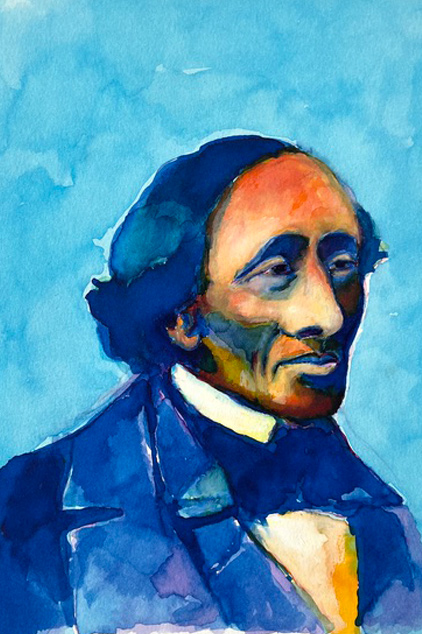
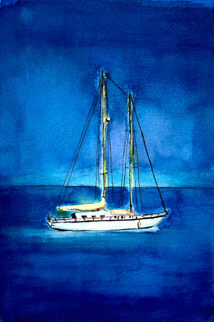
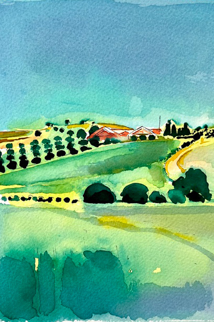
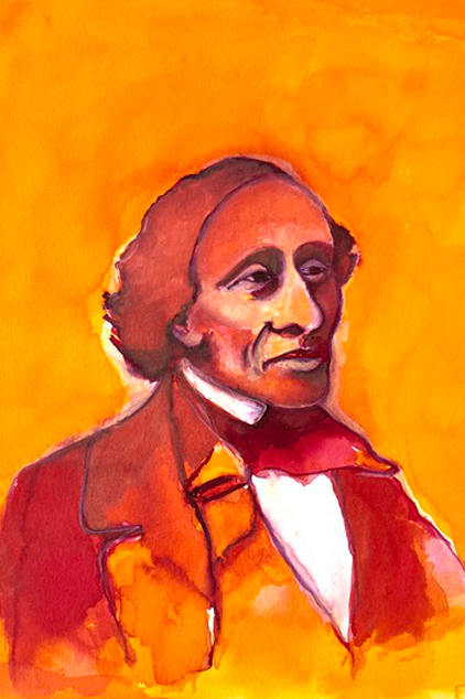
My collaboration with Cortes De Cima, a renowned winery in the Alentijo region of Portugal, spans several years and includes a complete visual identity built around illustration, Craftsmanship, and the expressive character of wine.
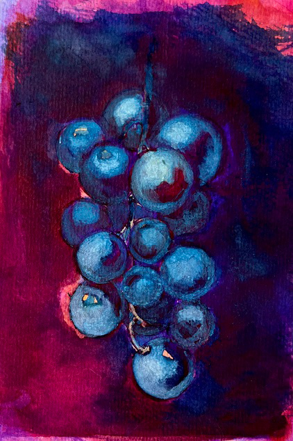
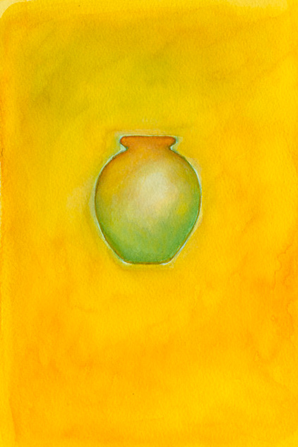
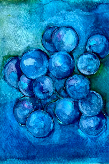
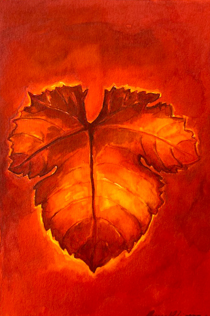
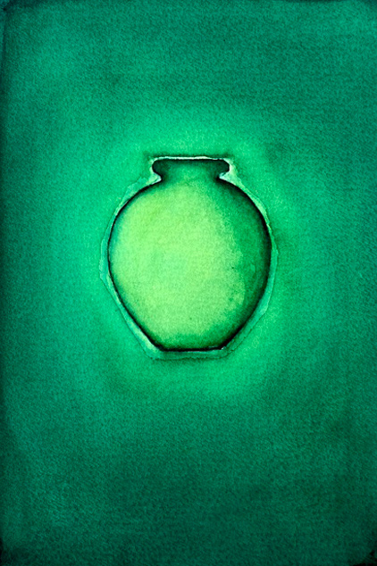
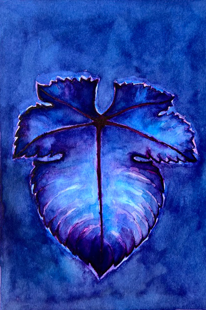
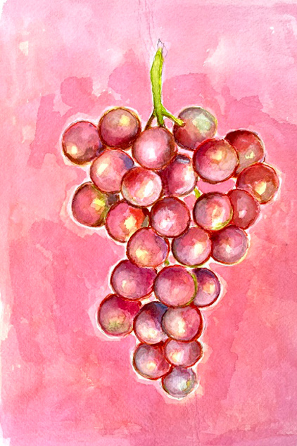
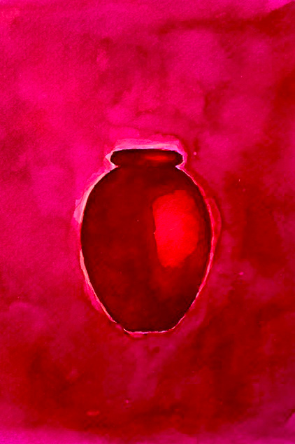
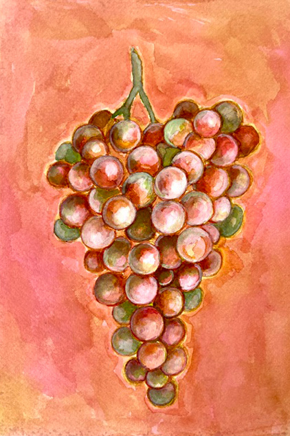
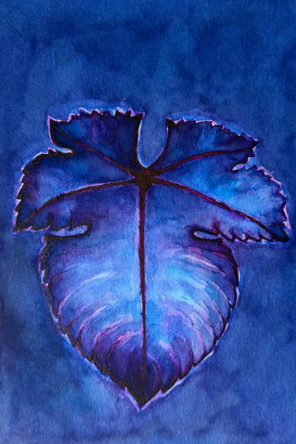
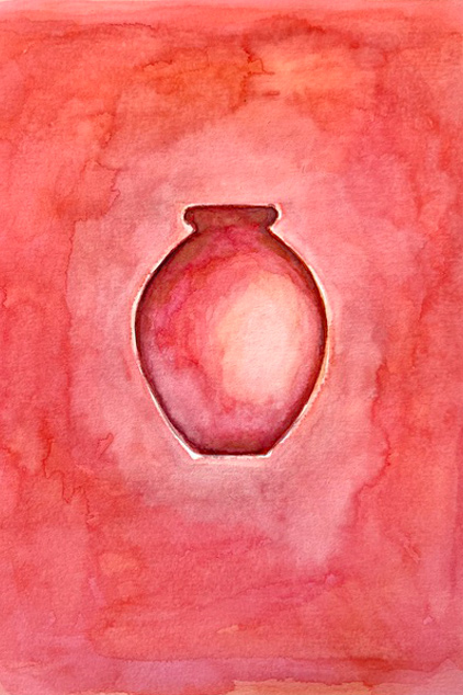
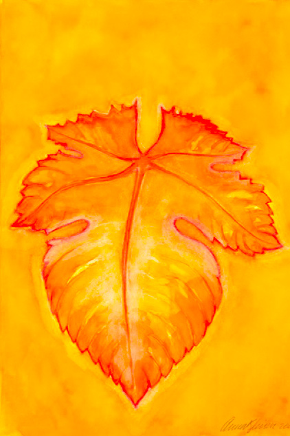
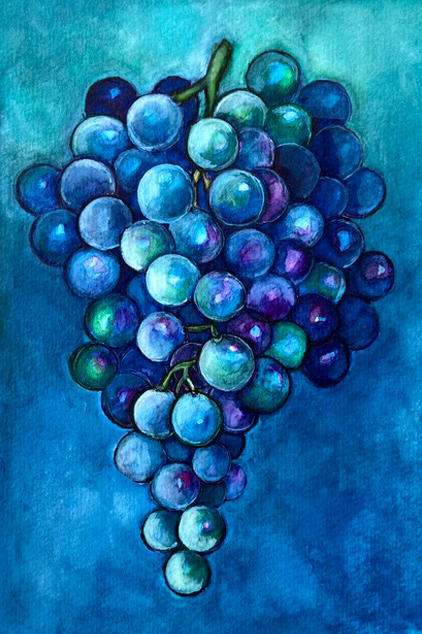
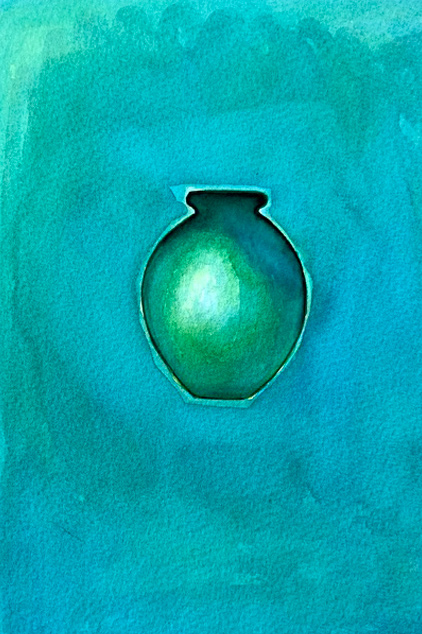
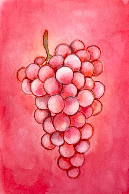
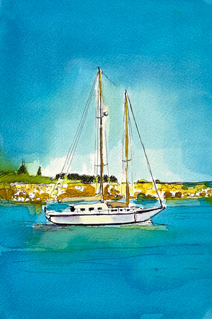
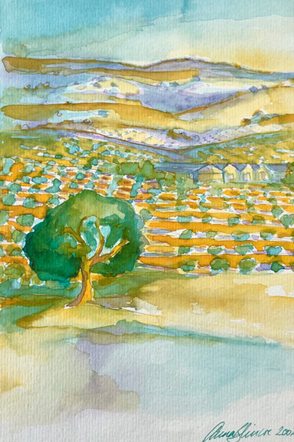
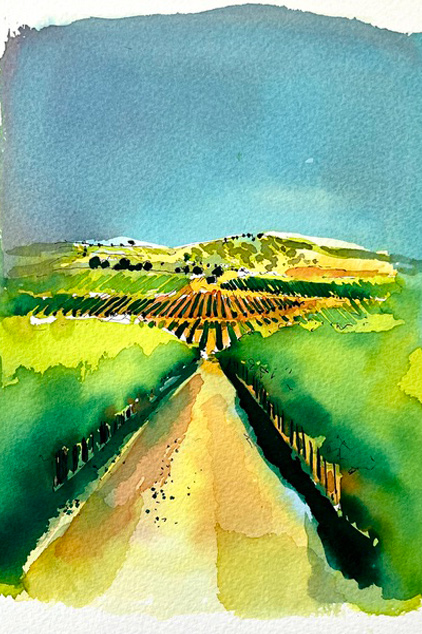
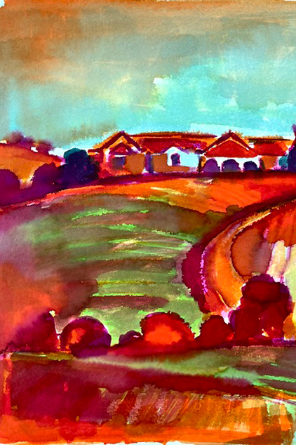
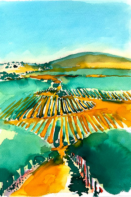
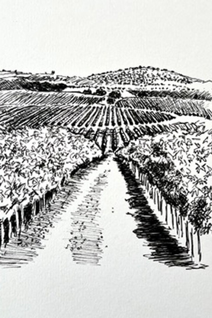
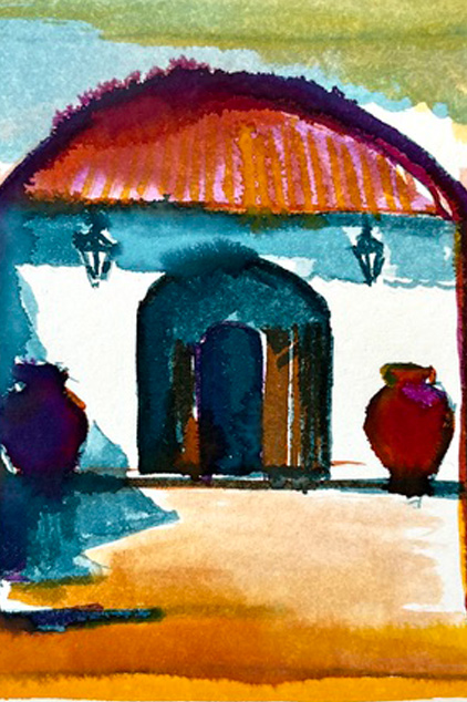
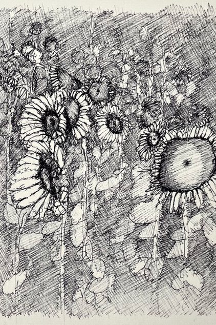
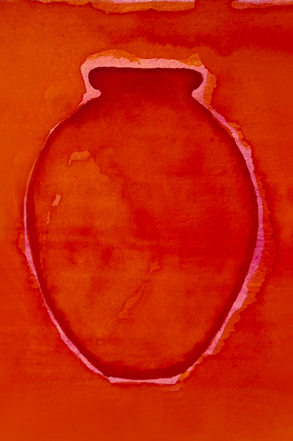
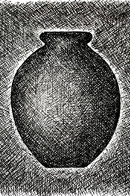
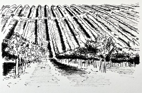
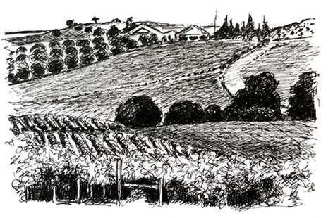
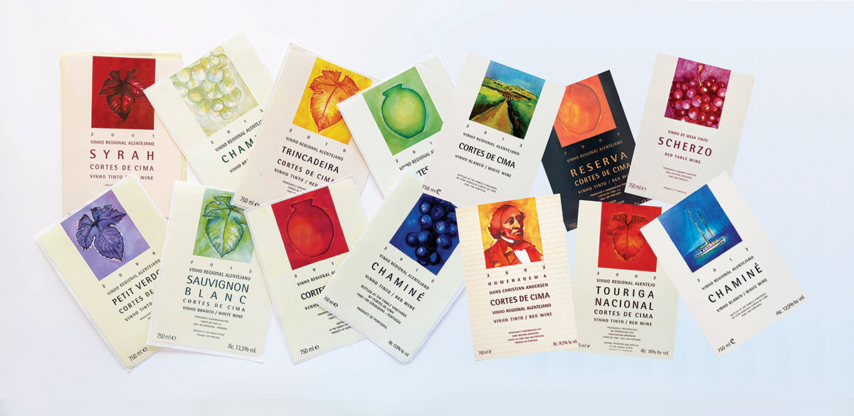
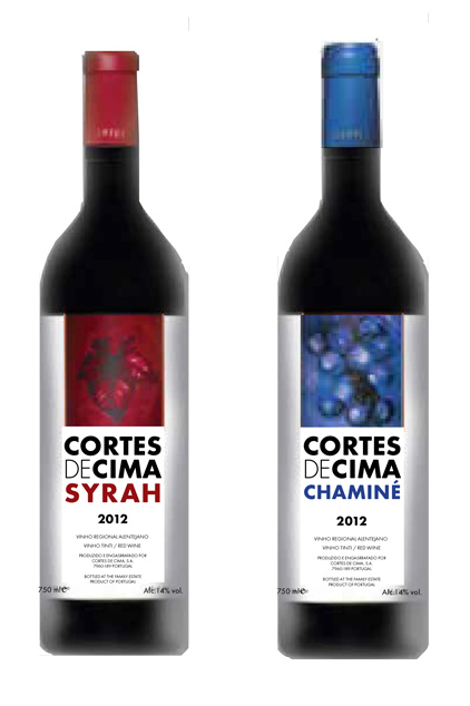
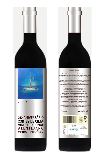
For the labels, I developed a series of artworks rooted in the natural elements of winemaking; grapes, leaves, amphorae, vineyards, and the warm southern landscapes. These motifs appear in both vivid watercolour and ink.
Colour plays a central role in the identity. Each wine is represented by a distinctive palette-rich reds, deep blues, glowing oranges- mirroring the mood, flavour, profile, and personality of the wine. This approach gives the collection a strong coherence while allowing every table to stand as its own expressive artwork.
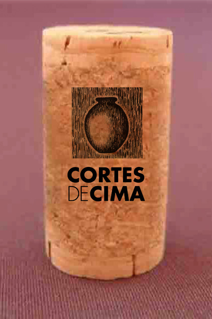
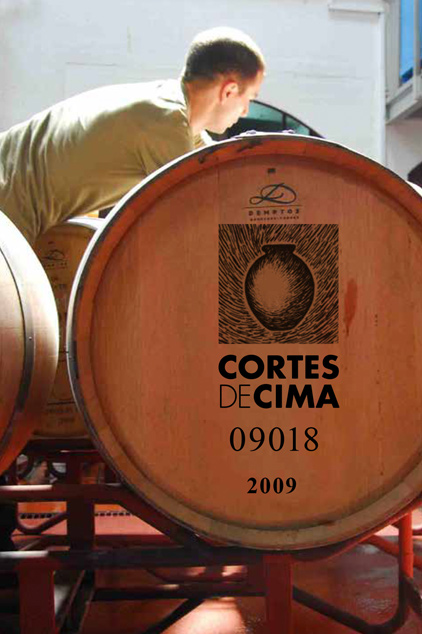
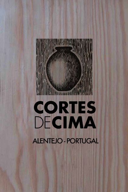
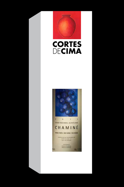
Beyond the bottle labels, my illustrations extend to packaging, wooden crates, cork branding, promotional material, and special-edition releases. The result is a cohesive visual language where art and product merge – a brand identity built around warmth, authenticity, and a strong sense of place.
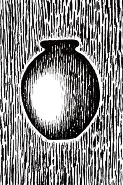
From strong graphic black and white line drawings to luminous colour fields, allowing it to function both as a logo element and as a storytelling device tied to tradition and craftsmanship.
The amphora symbol, which repeats throughout the identity, has become a signature of the Cortes De Cima brand.